Reports
Introduction
Reports are a graphical representation of the video analytics metadata collected from your locations running Camlytics Service software.
This is a very powerful analytics tool that allows you to research the trends of your business locations and channels in one place. Moreover, you can see shots from any of the cameras connected to the cloud in real-time.
For example, you can, without leaving your home or office, analyze event statistics from all stores of your chain which may be located in different cities and even countries.
There are many types of reports which will help you visualize the collected statistics in any flexible and custom way.
By default, the statistics data is stored in the cloud service for 3 months. However, if you need to see the data collected over a longer period of time, you can always increase the storage time of your data by adding extra storage units. Each storage period extends the data storage time by 3 months, i.e. to keep your data in the cloud for a year, you just need to add 3 extra storage units.
Described below is the difference between various types of reports and how they can be applied.
Single period
Single period report means that all data compared in the report is taken for one period of time, i.e. for example, you can compare the number of people entering and leaving today within one chart or compare the number of people who entered from different entrances over the past week in one chart. If you need to compare the same data over this week and the past week in the same chart, you would need to go with a multi-period instead.
Below are the available types of reports for a single period.
Multi period
Multi-period means that it is possible to compare data from different time periods in one chart. Therefore, you can compare the number of people coming in today with the number of people coming in yesterday (or any other day), all in one chart.
Available types of reports:
Real-time number
Current crossings
This type of report can be used only if the channel calibration includes the Line event triggers.
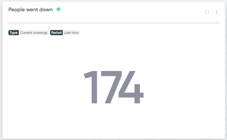
This is a very simple and demonstrative view of the report. It shows how many times the selected line was crossed by an object during a certain period of time. The data in the report is updated in real-time (data update delay is around 1-3 seconds).
This type of report can be used, for example, to display the number of people who came to a presentation. It would be convenient to display it on a large screen located in the presentation hall so that everyone could see this data in real-time.
In this report, you can choose the time period during which the objects crossing the selected line will be counted.
The image below shows the number of people who came in during the last hour. It is also possible to count all people coming in today or set the custom counting period.
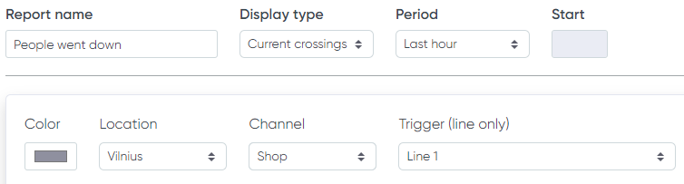
Current crossings report fields
The description of the form fields is located here. Only Line event triggers are available for this kind of report.
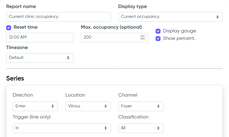
Current occupancy
This report allows you to dynamically calculate the difference in intersections between different lines.
For example, you can see how many people are currently in your cafe or warehouse which has many entrances, exits, and cameras. The number of people is determined by calculating the difference in the intersections of all lines towards exit or entrance on all cameras.
To use this type of report, you must set up Line event triggers on all entrances and exits. You need to set the time at which there are definitely no objects in the location as Reset time since the object counter starts from that moment.
The frequency of the report numbers update is 3-5 seconds.
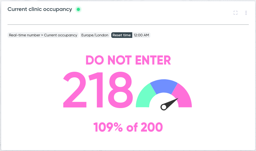
If you want to show the number of objects inside (for example, total 11 people inside property), select the display type Current occupancy.
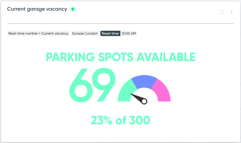
If you want to show vacant places (for example, vacant parking spots in garage is 11 out of 20), select the display type Current vacancy and be sure to fill in the Max occupancy field.
If you want to track the history of your current occupancy (maximum, average or median values) during day, week, month, etc., you would need to add the Occupancy history report in addition to this one.
Current occupancy appearance
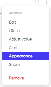
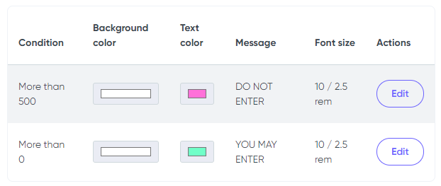
You can also set the occupancy report appearance dynamically depending on your business restrictions. For example, you can set that the report shows "You may enter" if the occupancy is up to 100 people and show "Do not enter" if the occupancy is above that number with different font and background colors. The appearance settings are available in the context menu of this report (see example below).
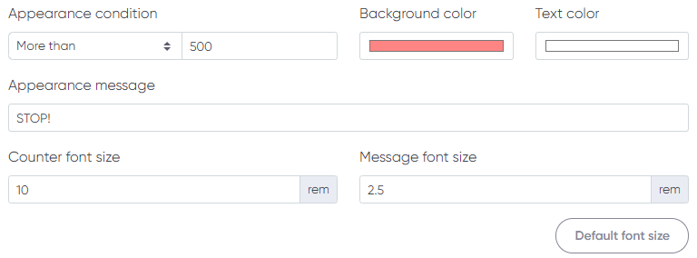
Below you can see the appearance settings to show "STOP" with red background if the occupancy is over 6 people and show "YOU MAY ENTER" otherwise.
Below you can see the data fields to fill for the new appearance setting. Message can be left blank.
Current occupancy report fields
The description of the form fields is located here. Only Line event triggers are available for this kind of report.
In general, the appearance settings are applicable to all real-time report types (Current occupancy, Current crossings or Current queue).
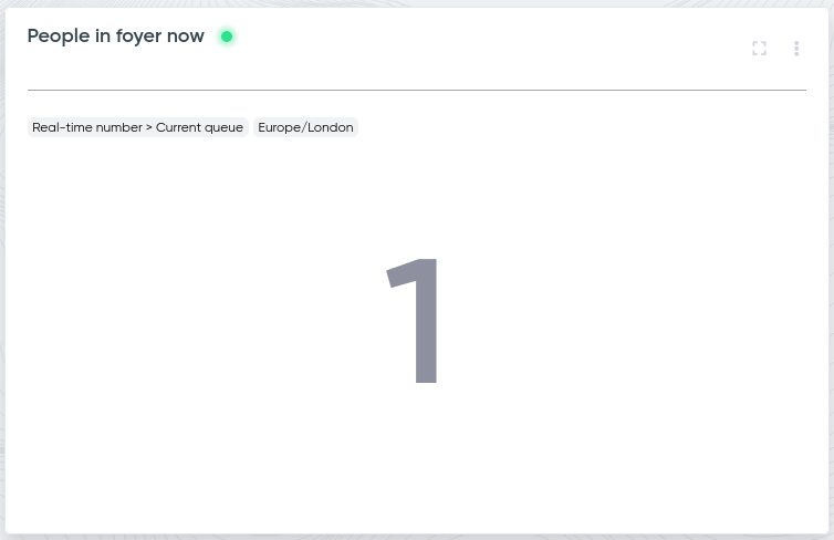
Current queue
This report is a powerful tool for real-time monitoring of the number of objects in a specific zone. This feature is ideal for analyzing and managing flows, whether it's monitoring a waiting area or tracking available parking spots.
The report allows you to track the number of people or objects in one or multiple defined areas. For example, you can see how many people are currently in your waiting area covered by one or multiple cameras. If multiple cameras are used, it is important to carefully configure the zones to ensure they do not overlap, as overlapping zones can lead to inaccurate counts.
If you want to display the number of vacant spots (e.g., parking spaces), choose the Current Vacancy display type. Ensure you fill in the Max Occupancy field to let the system calculate and display the remaining spots accurately.
To use this type of report, you must set up your channel with at least one Zone event trigger.
Once configured, the report will automatically update every 3-5 seconds, providing you with real-time data.
If you want to track the history of your current queue (maximum, average or median values) during day, week, month, etc., you would need to add the Queue history report in addition to this one.
Real-time number alerts & webhooks
If you have a Current occupancy, Current crossings or Current queue report and you want to associate its data with some particular action, you may opt for Alerts.
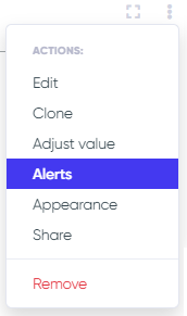
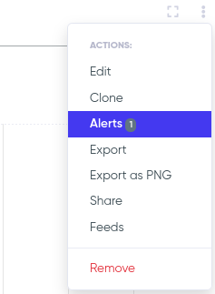
To add alert for your real-time report, call the context menu of the report.
There are 2 types of alerts:
- Webhooks
Email allows you to receive email when the report value is exceeded. For example, you want to get an email when there are more than 100 people in your shop.
Webhooks allow you perform any custom action when the condition happens. For example, you can display an alert on your own website when there are more than 100 people in your shop. Or you want to show the realtime occupancy rate in your locations on your website. In the configuration below the occupancy data will be sent to a http address via POST query every minute.
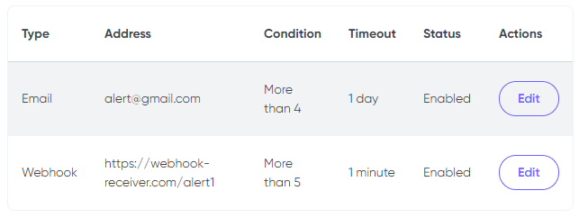
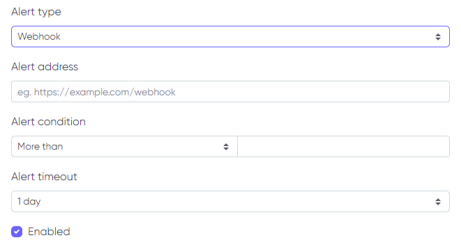
Below you can see the new alert fields. Alert timeout field defines when the alert will be repeated if the condition is fulfilled.
If you want to receive constant notifications on the current occupancy number or current zone queue you would need to set the alert condition as 0 and alert timeout as 1 minute - and the webhook will be called every minute with fresh data.
In case you are interested in webhooks for each analytics event on your location/channels, you should refer to the API docs.
Quantitative chart
Events
This type of report is used to compare the quantities of different types of events.
Events reports are divided into Comparison, Sum, All in one line, and Percent of Total.
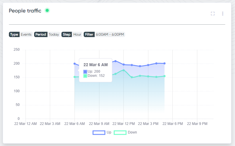
For example, the Comparison graph will help you compare the number of people who enter a room with the number of people who leave a room after a given time interval.
The graph below shows that there are fewer people who enter through the first entrance than people who exit through it.
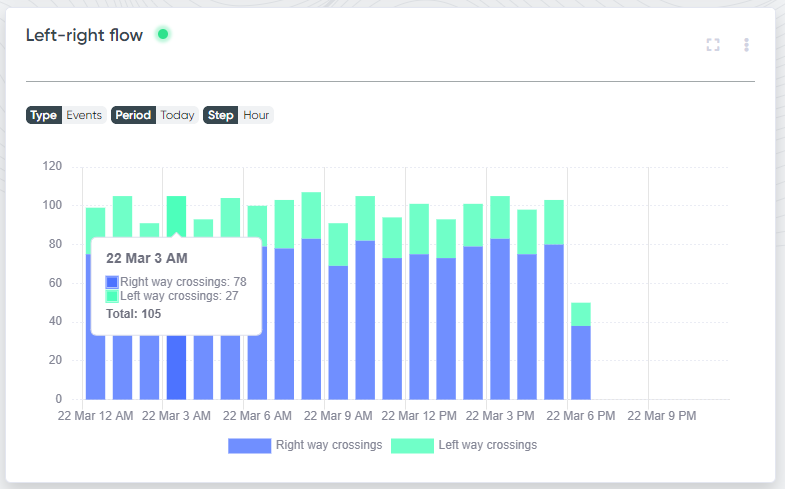
The Sum graph can, for example, be used to count people who have entered the room from several different entrances. Below you can see the total number of people who entered through multiple entrances.
The All in one line display type (single period only) combines all series into a single aggregated line, making it easy to see the overall trend across all selected sources at once.
The Percent of Total display type shows each series as a percentage of the combined total across all series, which is useful for visualizing the relative share of each source or event type.
Events report fields
To create the Events report, you need to fill in the following form (a description of its fields can be found here):
Activity
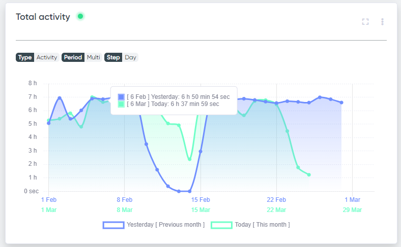
This type of report is used to assess how long in total objects (people, cars) were staying in the zone.
It can be used, for example, to see for how long your employees stayed in a workplace in total. Or how much time there were moving cars on a road.
Activity report fields
The form is filled in according to the description of fields. Only Zone event triggers are available for this report.
Occupancy history
This type of report is based on the Current occupancy report and represents the history of occupancy data from the real-time number.
It is very convenient for tracing your locations occupancy trends during day, week, month, etc. The calculated value can be maximum, median or average values of the real-time occupancy numbers.
Queue history
This type of report is based on the Current queue report and represents the history of queue data (number of objects inside a particular zone) from the real-time number.
It is very convenient for tracing your zone occupancy trends during day, week, month, etc. The calculated value can be maximum, median or average values of the real-time queue numbers.
Speed
This type of report is based on the vehicle speed detection method using the SpeedLine trigger, introduced in version 3.7.1. If you're running an earlier version, please update your software to access this feature.
The resulting chart can be created for one or multiple time periods, allowing comparison of average or maximum speeds across different intervals (for example, comparing current and past weeks).
To generate this report, first set up the SpeedLine trigger and specify the distance directly in the Camlytics Service desktop application. The distance measurement can be configured in meters or feet, depending on your settings in the desktop application. The resulting speed will be displayed in km/h or mph, based on the settings configured in the cloud portal.
After saving the report, you'll see something like this:
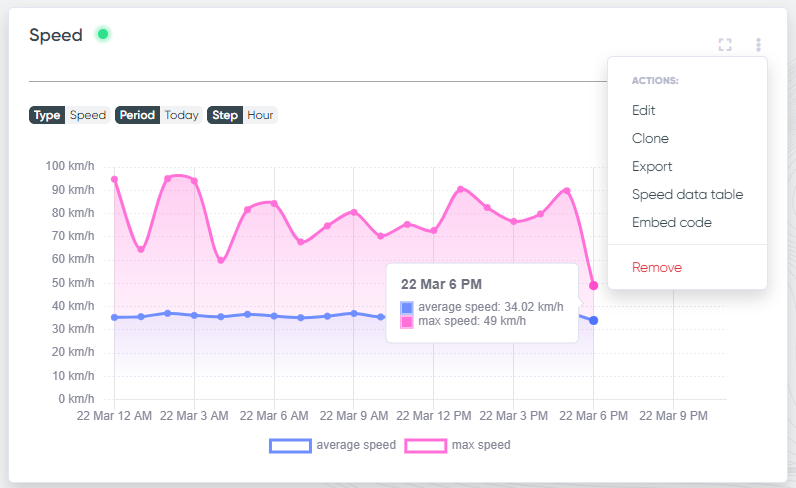
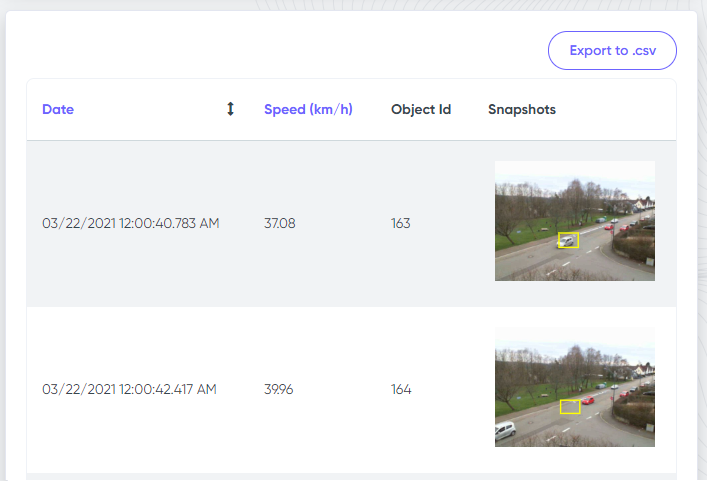
To access detailed speed data, open the context menu and select "Speed data table." The table will show individual speed entries along with event timestamps and options for viewing snapshots. Data filtering options and CSV export functionality are also provided.
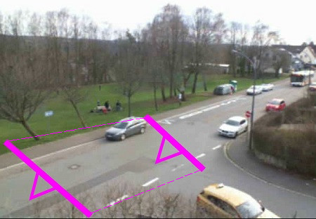
When calibrating Camlytics Service for accurate results, ensure a sufficient distance is configured for the SpeedLine trigger — the greater the distance, the more accurate the speed calculation. Additionally, position the SpeedLine away from camera image edges to guarantee vehicle detection occurs fully prior to crossing the first line of the SpeedLine trigger. See the example below, where speed is measured for vehicles traveling from north-east to south-west.
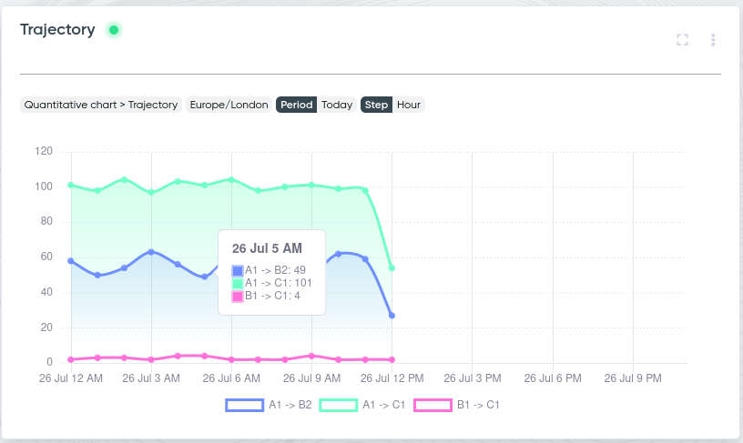
Trajectory
This type of report tracks and compares object movement trajectories using the SpeedLine trigger, introduced in version 3.7.1. If you're running an earlier version, please update your software to access this feature.
Using this report, you can analyze vehicle movement at intersections or other key locations to optimize traffic flow, traffic light settings, or priority signage.
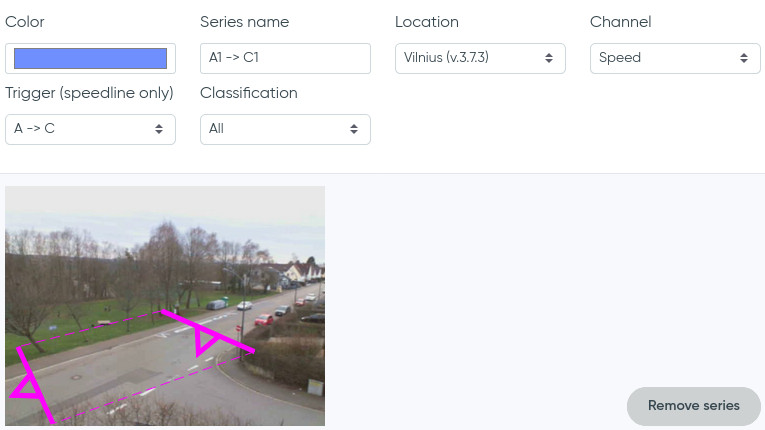
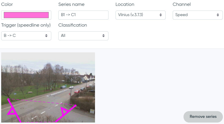
In the Camlytics Service desktop application, set up SpeedLine triggers on for each movement trajectory you wish to analyze. For instance, consider a T-junction with sides labeled A, B, and C, as illustrated below.
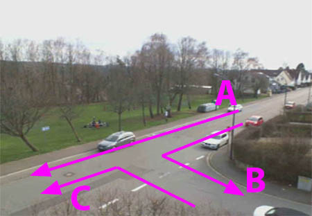
To analyze traffic flows—such as vehicles moving from A to B, A to C, and B to C—configure the SpeedLine triggers accordingly. Typically, you'll set one SpeedLine trigger per direction, but if there is two-way traffic, multiple triggers may be necessary.
In your report, create individual series representing each desired trajectory (e.g. A → B, A → C, B → C).
First series A -> B
Second series A -> C
Third series B -> C
The resulting chart visualizes activations of each trajectory, clearly indicating the frequency and pattern of vehicle movements across the monitored area.
Conversions
Use this report to visualize conversion metrics — how effectively your visitor traffic turns into business outcomes (e.g., revenue per visitor or other ratio-based indicators).

The form works the same way as in Events reports: you can select a period, step, and apply time filters. Additionally, this report allows you to add custom data points, which will be included in the conversion calculation.
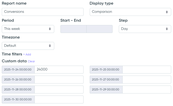
If you enter custom values (for example, your store's revenue) and the series contains visitor-count data, the chart will display the revenue per visitor for the chosen period.
Example: view yesterday's conversion — how much revenue your store generated relative to the number of visitors who entered.
If you need to regularly update your conversion data (for example, once per week), go to the Edit report page and add the new values there.
The display types available for a single-period Conversions report are the same as for Events: Comparison, Sum, All in one line, and Percent of Total.
Distribution chart
Density
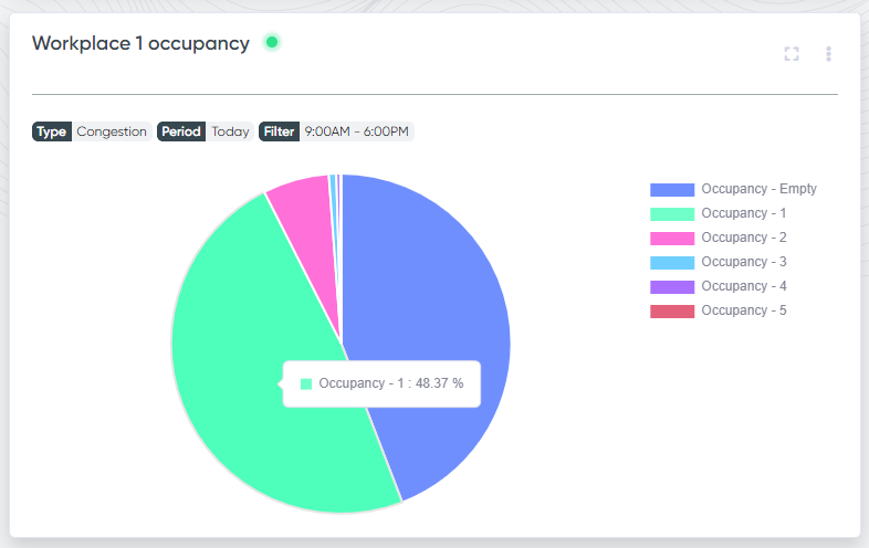
If calibration in your channel includes Zones, then you may be interested to know the distribution of the number of objects (people, cars) in these zones. This report can be very useful if you want to observe and assess the congestion of the zones - analyze queues or other places with large quantities of people or vehicles.
The report below shows that for 0.25% of the time the hallway was empty, for 7.17% of the time the hallway had one person in it, 2 people for 43.27% of the time, 3 people for 41.51%, 4 for 7.73% and 5 people for 0.07% of the time.
The percentage of time is visible when you hover over the desired sector of the chart.
Density report fields
The form is filled in according to the description of fields. Only Zone event triggers are available for this report.
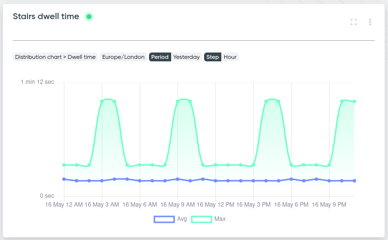
Dwell time
The Dwell Time report shows how long objects remain in a specific zone, with detailed statistics on average and maximum dwell time. This report helps you understand typical waiting times — for example, how long people stay in a queue or waiting area. The chart can display average, maximum, or both dwell time values. This allows you to analyze how long objects typically stay in the zone and identify peak durations.
In the example below, maximum dwell time peaks occur around 3 AM, 4 AM, 9 AM, 10 AM, 4 PM, 5 PM, 10 PM, and 11 PM, reaching up to 1 minute. During other hours, the maximum time spent in the zone remains much lower. The average dwell time stays relatively stable throughout the day, slightly increasing during peak periods but never exceeding 15 seconds.
This pattern may indicate regular bursts of activity in the monitored area (e.g. people using the stairs in waves), while the average time individuals spend in the zone remains short and consistent.
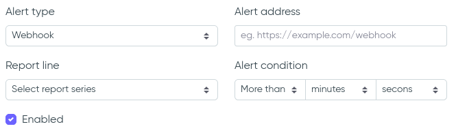
Dwell time alerts
You can configure automated dwell time alerts that trigger when thresholds are crossed.
Alerts can be sent via email or webhook, based on the following conditions:
- "More than" or "Less than" a specified time value
- Selected report series (e.g., Max dwell time)
- Triggered when current value meets the configured condition
This feature is useful for monitoring delays, zone misuse, overcrowding, or compliance in safety-critical areas.
Alert priority logic
Only one alert can be triggered per check. If multiple alerts are valid at the same time, the system applies a priority order to determine which one to send:
1) "More than" alerts have higher priority over "Less than" alerts. Example:
- Alert 1: Trigger if dwell time is more than 50 sec..
- Alert 2: Trigger if dwell time is less than 100 sec..
- Current dwell time = 70 sec.
- Only Alert 1 will fire, even though both conditions are true.
2) Among alerts in the same direction (e.g. multiple "More than" alerts), the system chooses the one with the highest threshold that is still satisfied. Example:
- Alert 1: Trigger if dwell time is more than 20 sec.
- Alert 2: Trigger if dwell time is more than 40 sec.
- Current dwell time = 50 sec.
- Only Alert 2 will fire. Alert 1 is skipped even though its condition is also true.
This ensures that only the most critical alert is triggered and prevents duplicate notifications for overlapping conditions.
Dwell time report fields
The form is filled in according to the description of the fields. Only Zone event triggers are available for this report.
Vehicles classification
This report allows you to assess the distribution of the vehicles types.
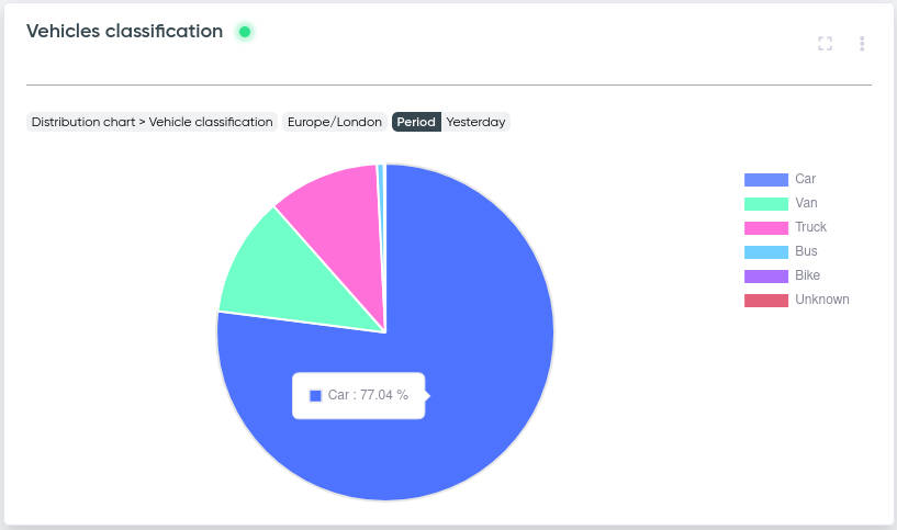
Use this report to analyze the distribution of detected vehicle types and understand the composition of traffic.
It helps you see how different categories — such as cars, trucks, buses, motorcycles, or other classes — contribute to overall vehicle flow.
You can add multiple series, and their data will be aggregated. For example, if you have three entrances, you can add all three as separate series and view the combined totals on the chart.
The display type can be set to Absolute (total count per vehicle category) or Relative (percentage share of each category).
Vehicles classification report fields
The form is filled in according to the description of the fields.
People gender & age
This report allows you to assess the distribution of faces by gender and age.
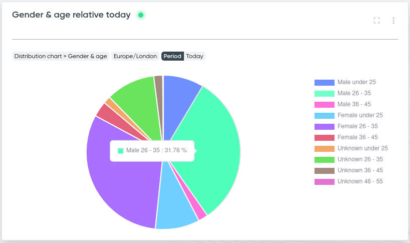
You can view the data in four different modes:
- Absolute Distribution – displays the total number of users in each gender–age group.
- Relative Distribution – displays the same breakdown, but in percentages instead of absolute values.
- Gender Overview – shows the overall gender distribution without age details.
- Gender + Majority Age – shows gender distribution, highlighting the dominant age group within each gender.
You can add multiple series, and their data will be aggregated. For example, if you have three entrances, you can add all three as separate series and view the combined totals on the chart.
People gender & age report fields
The form is filled in according to the description of the fields.
Heatmap
Motion
Heatmaps show "hot" and "cold" areas in a video scene that indicate places where objects concentrated for a long time, i.e. areas with high and low activity.
Heatmaps can be very useful for analyzing the concentration of various objects – people, vehicles, etc.
For example, on the trading floor of a store, you can track the areas of the highest buyer activity as well as the areas that people do not visit. This data can be very efficiently used to optimize the layout of the premises. In the image below, you can track the areas where cars tend to slow down more often.
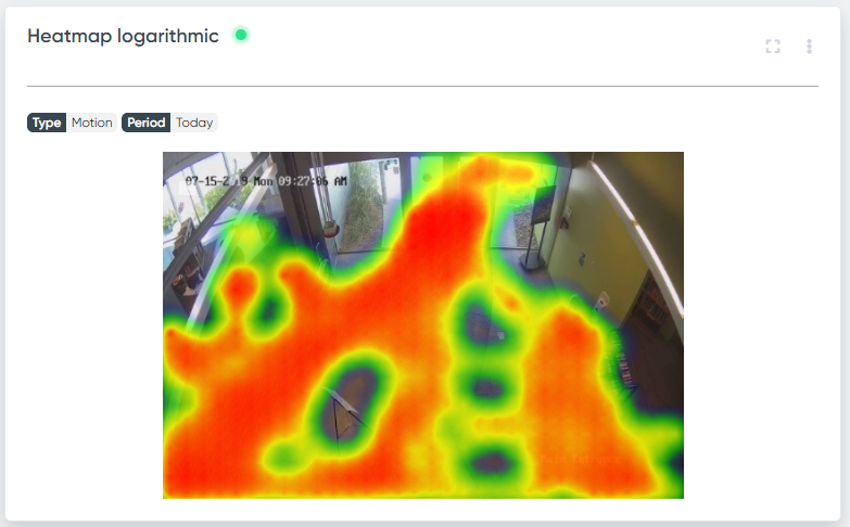
Heatmaps are divided into two types:
- Linear
- Logarithmic
You can see the way the linear map differs from the logarithmic in the pictures below.
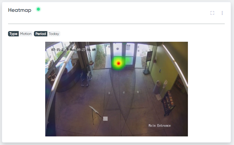
If it is important to see the zones with maximum activity and the lower activity zones are not that important, then you should choose a linear heatmap.
If your goal is to look at the zones where there was at least some activity, even though it is much lower than the maximum, then the logarithmic heatmap is more suitable for you, as the difference between the values on it is smoothed out with the decimal logarithm.
Heatmap grouping
It is possible to group heatmaps from various channels. What can it be used for?
For example, you have several cameras in the same room. If you create reports on a heatmap without grouping, then there may be a zone with high activity in the view of one of the cameras which is not visible from any other cameras. In such a case, the zone of maximum activity of the heatmap of this camera will be the same shade as the zone of maximum activity of heatmaps of other cameras, but the absolute values can differ a lot. This makes it very difficult to compare heatmaps on different channels.
To show the "real" situation, the reports for cameras located in the same room (or for cameras with intersecting visibility zones), need to be combined into one group. In this case, you will get a relevant view of the concentration of objects on all heatmaps of the group put together.
Motion report fields
Heatmap adding form:
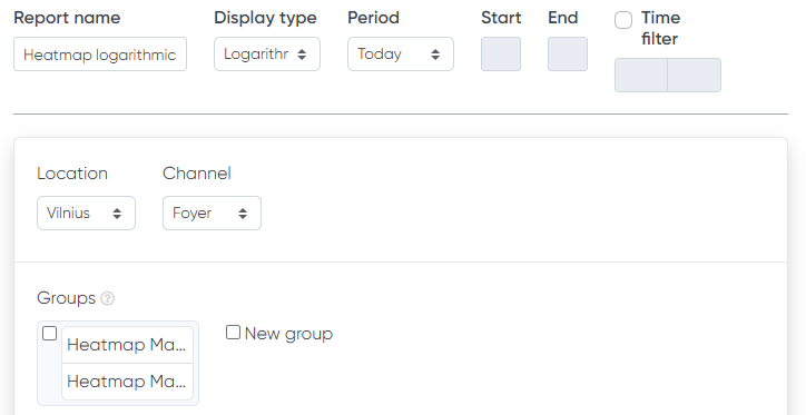
Here, on top of the general fields, the group selection for your heatmap is added.
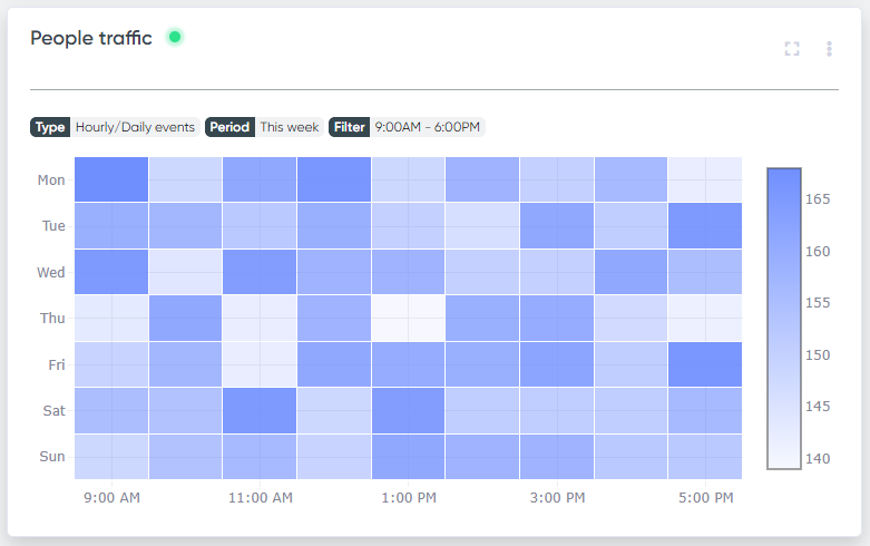
Hourly/Daily events
This report shows the distribution of events by day or by hour, depending on the type you have selected.
The report gives a great overview of your premise activity during the whole week or the whole month.
For example, on the map below, you can see at what time and what day of the week more cars enter the parking lot.
Daily/Hourly events report fields
Description of form fields here.
Add report
To add a new report, click the Add report button in the upper right corner of the screen. In the drop-down menu, choose whether there will be a report for one period of time or for several periods.
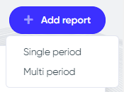
After choosing a reporting period, you get to the page for selecting a report type.
Here you need to choose the type of data visualization.
Below are the available types of reports.
- Current crossings (Single period only)
- Current occupancy (Single period only)
- Current queue (Single period only)
- Events
- Activity
- Occupancy history
- Queue history
- Speed
- Trajectory
- Conversions (Single period only)
- Density (Single period only)
- Dwell time
- Vehicles classification (Single period only)
- People gender & age (Single period only)
- Motion (Single period only)
- Hourly/Daily events (Single period only)
Events, Dwell time, Activity, Trajectory, Conversions and Occupancy reports are divided into display types:
- Comparison - displayed as lines, one line for each of the series, represents the absolute quantities.
- Sum - displayed as stacked bars, one bar for each of the series, represents the absolute quantities and the total sum of the series.
- All in one line - (Events and Conversions, single period only) aggregates all series into a single line showing the combined total over time.
- Percent of Total - shows each series as a percentage share of the combined total across all series.
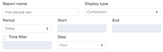
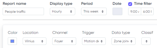
Common fields
The forms for adding various types of reports differ from each other, but they have many fields that are common to all.
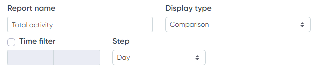
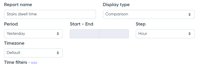
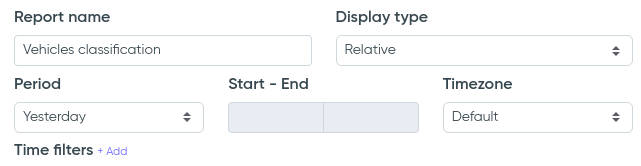
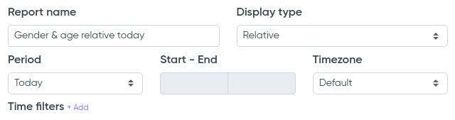
Report name - this field contains the name of the new report. By this name, you can identify your report on a dashboard. We recommend using a clear and descriptive name that allows you to exactly identify which data is displayed under the report. For example, "Number of people entered today" or "Comparison of people entered this week".
Display type - in this field you must select the display type of the report. Events, Dwell time, Activity and Occupancy reports support Comparison, Sum and Percent of Total; single-period Events and Conversions additionally offer All in one line; Motion heatmap is divided into linear and logarithmic.
Period - defines which period you want to display the data for. You can select a predefined period, such as today, yesterday, or last month, or you can specify any custom period by selecting the start and end dates of this period in the corresponding fields.
Time filter - by activating this field, you can filter events that happen at a specific time of day. For example, if you are only interested in the number of incoming people in the period from 8:00 AM to 11:00 AM, you must activate the time filter and specify the initial and final value of this interval in the corresponding fields.
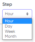
Step - this field indicates the grouping period of the data in the report. This field changes depending on the reporting period. This improves the relevancy and visibility of the charts. If the reporting period is 1 or several days, it is better to choose the Hour step, if the period is one week or several weeks, the Day will be the best step, and so on. The step is adjusted automatically every time you change the reporting period.
Color - the series on the chart will be shown in the selected color.
Series name - enter the name by which you will distinguish your series in the legend of the chart. Make the name as descriptive as possible, for example, "People going down the escalator".
Location - choose the location that contains the channel that you are interested in.
Channel - select the channel that you want to display data from.
Event trigger - select the event trigger that generates visualized data. For example, Line for the counting results display.
Data type - choose the
type of event
that is going to build the series.
For example, Line crossed, Camera obstructed, or Zone max. occupancy.
Classification - this field is used to filter the report data by the origin that generated that data. For example, if you want to display only counting for vehicles and skip pedestrians in your report, choose Vehicle. Note, that this field must be used only if you know exactly what you do (calibration wise) as it can alter the display results significantly. We recommend leaving it as a default.
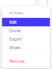
Edit/Remove/Export/Clone report
To edit the report, click the report menu button in the form of three dots in the upper right corner. In the menu that opens, select the Edit item.
In the form that opens, make the necessary changes and save the report.
The editing form is no different from the report adding form.
Export report
You can export any report data into a .csv or .png file except for Current crossings and Current occupancy reports.
To export a report, click the report menu button in the form of three dots in the upper right corner. In the menu that opens, select the Export item.
The .csv file with data will be generated for all kinds of reports except the lifetime heatmap. In this case, the .png image will be generated.
Remove report
To remove a report, click the report menu button in the form of three dots in the upper right corner, and in the menu that opens, select Remove. In the window that appears, confirm the deletion of the report by clicking the OK button.
Clone report
Cloning allows you to duplicate all the report form fields to be able to add a replica if you add multiple similar reports.
Expand report
If your report contains statistics for a long period of time, then a large amount of data can be inconveniently squashed.
In this case, you can expand your report to the full width of the screen by clicking the Expand button in the upper right corner.

Similarly, you can shrink back the report to its original width.
Sorting reports
You can sort reports on the panel by dragging and dropping.
To drag a report, hover over the area with report title, left-click and hold the mouse button, then move the report to a new location.
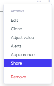
Share/Embed report
If you want to display any report on your own website or solution you can insert it via embed code, just as you would do with a YouTube video! To do that, just choose the re item from the report context menu.
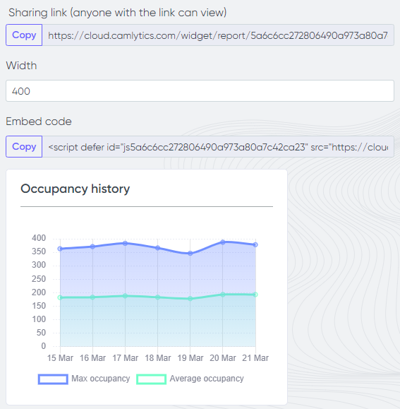
Width - adjust the max widget width.
Sharing link - comes in handy when you want to share your report with someone why doesn't have access to your cloud profile. Anyone with this URL will be able to see the report.
Embed code - text that you would insert into your webpage HTML code to display the report on that page. All embedded reports are updated dynamically without needing to refresh the page.
Report feeds
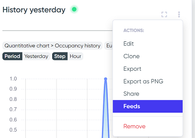
If you want to export your report data dynamically via JSON or CSV format, you can do it via Feeds option.
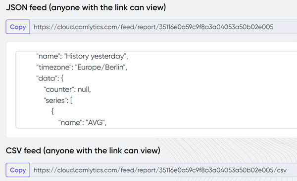
JSON feed - represents numeric values of the chart data. Updated every time the chart data is updated.
CSV feed - represents numeric values of the chart data. CSV file will downloaded on each query.
Email reports
If you want to receive daily/weekly/monthly/etc emails with the data from any of your counting reports, you can set it up via Feeds.
See this article for the information on how to set up periodic email reports, or check the video below.